NEXT FOUR DAYS
MISSION STATEMENT:
USE CREATIVITY TO DIRECT PURPOSE. KEEP IT SIMPLE. ONLY GOOD IDEAS.
“Ian is a rare talent.”
The most important part of realizing a brand is to know what truly matters. We created a list of our principles and used them to inform our mission statement.

BRAND PILLARS
Next we defined our brand pillars. These are our core. They serve as a checklist to make sure our values are being considered in communication and our business development.
BOLD is simplicity with confidence.
ORIGINAL means creative, and reminds us that each journey is unique, as is every client.
RAD to us is knowing when you know. Rad is a simple emotional chord that plays when it’s right.
ALIGNMENT with purpose. The road forward is never a straight line, and it’s great to get lost, as long purpose serves as your compass and we keep aligned with your destination.
“Ian is one of the most fascinating people. His brain is completely unique and generates ideas that are entirely different. Ian will help any brainstorm and take an idea to new extremes. ”

MANIFESTO
YOU KNOW A GOOD IDEA WHEN it’s simple. NO moving parts or EXPLANATIONS needed. NOT THE complexity of the great ideas, or the false expectations OF the best ideas ever, simplicity ALLOWS the good idea TO BE A physical feeling, aN EXHALE, THE KNOWING pause BEFORE transformative action. ONE TIME ONLY KEYS, GOOD IDEAS AREN’T FOUND ON A DATA HEAP, ONLY OUT IN THE WILD. ThE HUNT IS INSTINCTUAL LIKE COMPETITION OR LUST. IT MUST START WITH ACTIVE LISTENING, THE RIPPING OF PAGES FROM EXPENSIVE BOOKS, SCRIBBLING, UNDERLINING, REASSEMBLING, BLOWING UP. ONE MUST pull every string until one LIGHTS UP LIKE NEON. There will be no question thats the good idea When you know it, you’ll know it, and you won’t be the only one. It’s that simple.
Our manifesto is the inspired tone of our mission. Our company tagline, GOOD IDEAS ARE SIMPLE, comes directly from the copy.


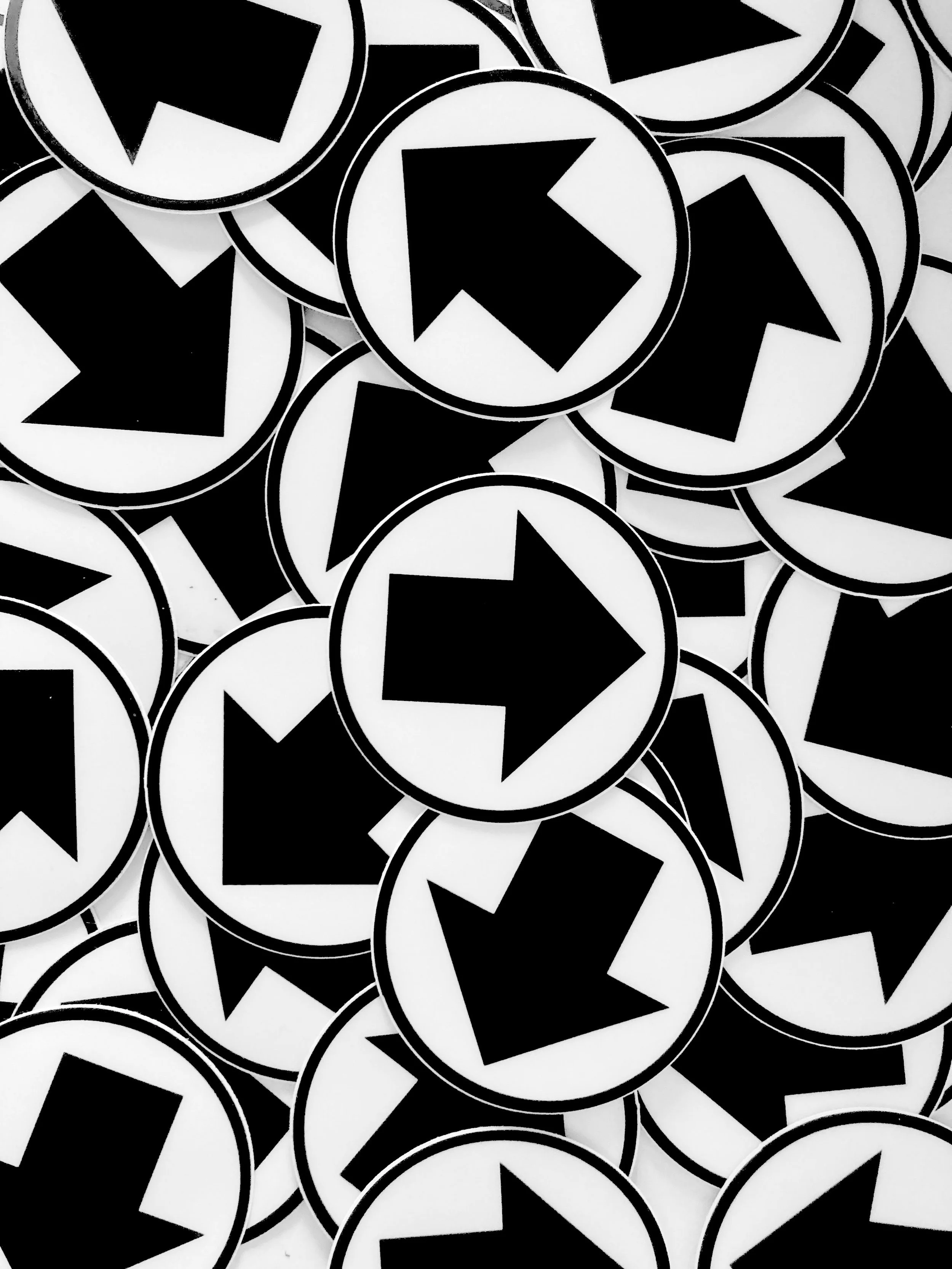
We hold up our logo to any idea or project to make sure it aligns with our mission.
Our arrow logo represents a triangle, our unique formulation of advertising, branding and marketing. and since our mission is guidance, the triangle became an arrow.
The design is BOLD which reflects our tone of voice, It’s designed to move freely, ALIGNING with each client their own way. It’s designed to move freely, having no set top or bottom. This unique quality in a logo speaks to our ORIGINALITY.
Our logo is a sticker, and that’s pretty RAD. It points to other things and celebrates how special they are. That quite simply, is what we’re all about.